A Materials-First Guide to Creating a Warm, Layered Home
When most people think about interior design, they think about color first. Paint swatches, bold accent walls, trendy hues, and “the perfect neutral.” And yes, color matters.
But here’s the truth: texture matters more than color when it comes to creating a home that feels elevated, welcoming, and finished.
Color can set the mood, but texture creates depth. It adds warmth, contrast, and personality without overwhelming a space. And if you’ve ever walked into a room that felt instantly cozy, calming, or expensive without being overly decorated, it wasn’t the paint color doing all the work. It was the materials.
In this guide, we’re breaking down why texture is one of the most powerful tools in interior design; and how to use layered materials to create a warm neutral home that feels timeless and lived-in.
Why Texture Matters More Than Color
Color is often the first design decision people make, but it’s not always the most impactful. Even the most beautiful color palette can feel flat if everything in the room is smooth, shiny, or one-note.
Texture adds dimension in ways color simply can’t.
When you layer textures, you create: visual interest, warmth and softness, contrast and balance, depth through shadows of light, and a more “designed” look without clutter. This is especially important in neutral interior design, where the palette is intentionally restrained. In warm neutral spaces, texture becomes the statement.
Photo credit: TwoPages Curtains
Texture Is the Secret to a “Finished” Home
A room without texture can feel unfinished even if it has expensive furniture and a beautiful color scheme. That’s because texture is what gives a home that collected, intentional feeling. It’s what makes a space feel real, livable, and elevated.
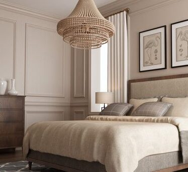
Texture shows up in the details: the grain of natural wood cabinetry, the softness of a wool rug, the movement of linen drapery, the patina of aged brass hardware, and the subtle variation in honed stone.
These materials create depth without needing bold colors, busy patterns, or trendy decor.
How to Layer Texture in Interior Design
Layering texture is one of the best ways to make a home feel warm and sophisticated. The key is mixing finishes that contrast with each other.
Think in terms of opposites: smooth v. rough, matte v. glossy, soft v. structured, woven v. polished, organic v. refined…
A well-layered room doesn’t rely on one standout element. It’s built through multiple small decisions that work together.
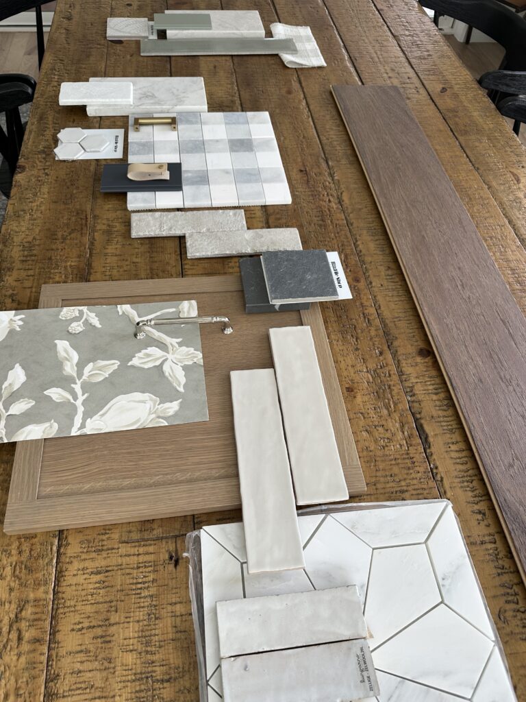
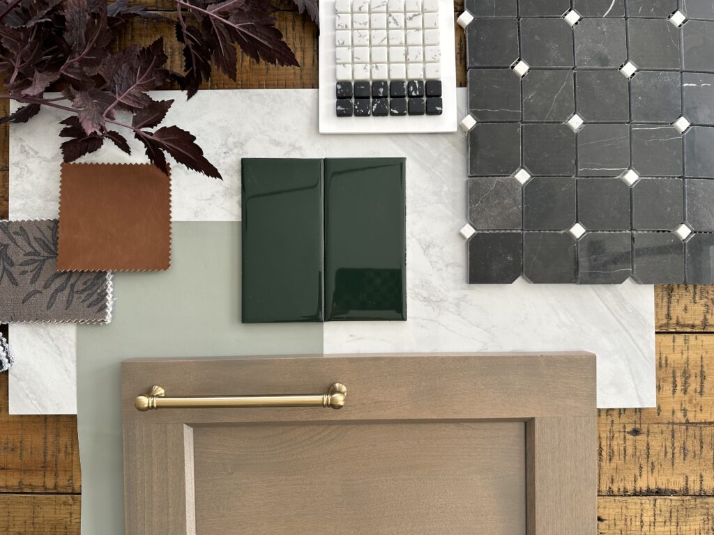
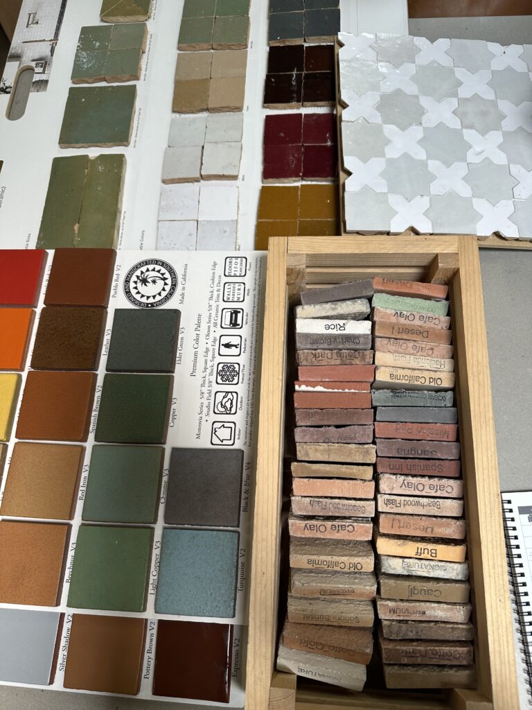
The Best Materials for a Warm, Layered Interior
If you want to create a timeless home, focus on materials that bring natural texture and subtle variation. These are some of the best interior design materials for warmth and depth.
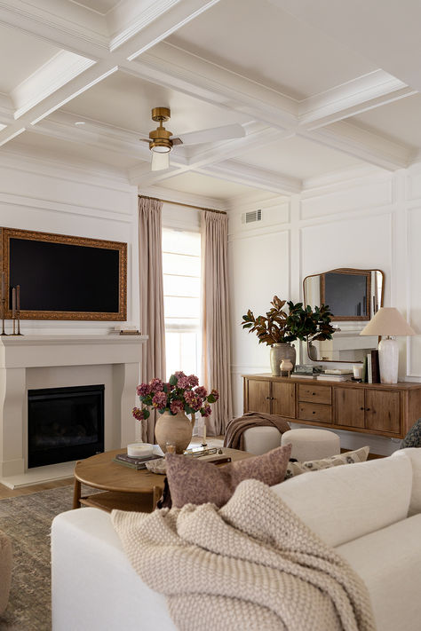
Plaster, Limewash, and Textured Wall Finishes
Plaster walls and limewash finishes are a favorite in high-end interior design for a reason: they instantly make a space feel custom.
Unlike flat paint, textured wall finishes catch the light and create movement. They add softness and depth, especially in warm neutral interiors.
Best for: living rooms, entryways, bedrooms, powder baths
Design tip: keep the palette tonal so the texture becomes the focal point.
Natural Wood for Warmth and Character
Wood is one of the most effective ways to bring warmth into a home. It creates contrast naturally, thanks to grain and tone variation.
Whether you’re using white oak, walnut, reclaimed beams, or warm-toned cabinetry, wood adds richness without relying on color.
Best for: flooring, cabinetry, furniture, ceiling beams
Design tip: mixing wood tones adds depth—as long as undertones feel cohesive.
Stone Finishes That Feel Timeless
Stone is the definition of quiet luxury. Marble, limestone, travertine, soapstone—these materials add depth through natural veining and texture.
For warm interiors, honed and leathered finishes tend to feel softer and more livable than polished stone.
Best for: kitchen countertops, fireplaces, bathrooms, flooring
Design tip: choose stone with subtle movement to avoid a sterile look.
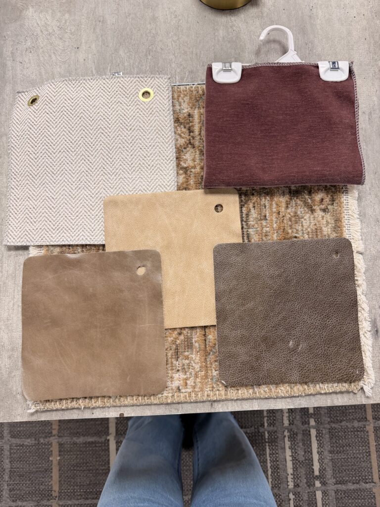
Linen, Wool, and Natural Textiles
Textiles are essential for making a home feel inviting. Linen, wool, cotton, and woven fabrics soften hard surfaces and bring comfort into a space.
In neutral interiors, textiles also add tonal variation, even when the colors are similar.
Best for: drapery, upholstery, bedding, pillows, rugs
Design tip: don’t underestimate the power of a high-quality rug—it sets the entire mood of a room.
Leather for Depth and Contrast
Leather is a timeless interior design material that brings warmth and sophistication. It’s also a great way to introduce contrast in neutral spaces without using bold colors.
Leather ages beautifully, which adds to that collected, lived-in look.
Best for: chairs, bar stools, benches, accent furniture
Design tip: warm cognac and deeper brown leathers work especially well in warm neutral palettes.
Aged Brass and Warm Metal Finishes
Metal finishes act like jewelry in a room. They add shine, contrast, and polish, which is essential in spaces that lean heavily neutral.
Warm metal finishes like aged brass, antique bronze, and blackened steel help a home feel elevated without feeling cold.
Best for: hardware, lighting, plumbing fixtures, mirrors
Design tip: mixing metals is fine—just keep it intentional and consistent.
Woven Materials for Organic Warmth
Woven textures bring softness and an organic feel that balances more structured or modern elements.
Think jute rugs, cane furniture, woven pendants, seagrass baskets, and rattan accents.
Best for: rugs, lighting, accent furniture, decor
Design tip: woven materials are especially effective in open concept spaces to prevent them from feeling too stark.
The KBD Takeaway
At KBD, we believe the most timeless interiors are built from the ground up, with thoughtful material choices and layered textures that makes a home feel warm, intentional, and lived-in.
Because the goal isn’t just a pretty space…it’s a space that feels good to be in.
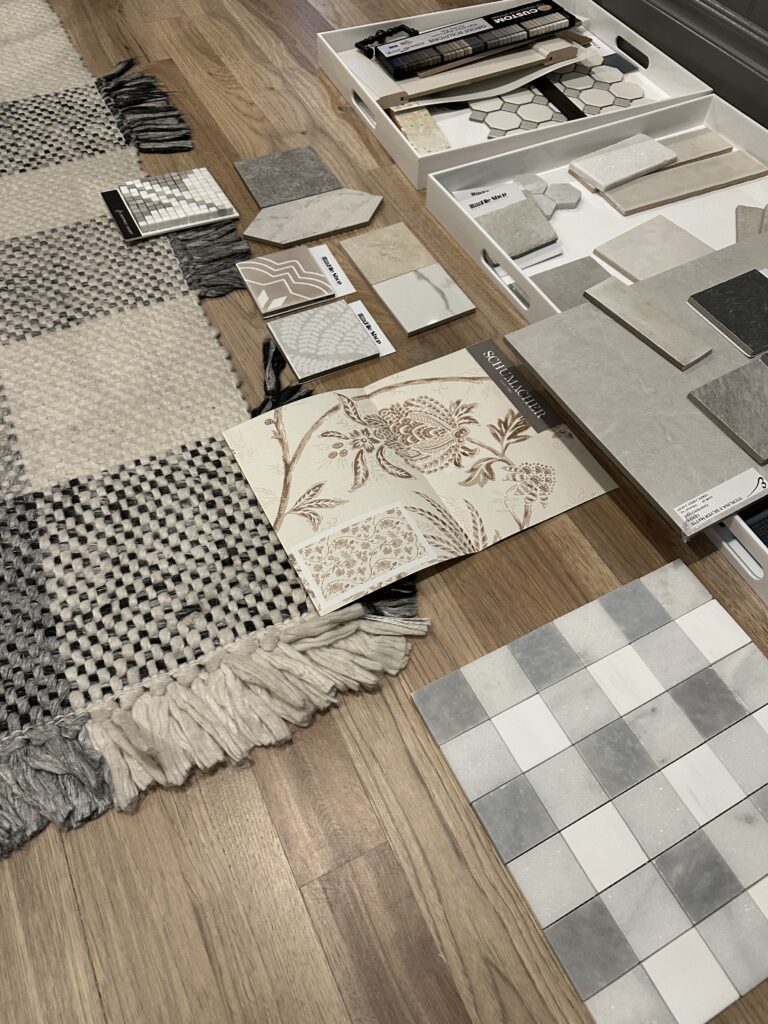
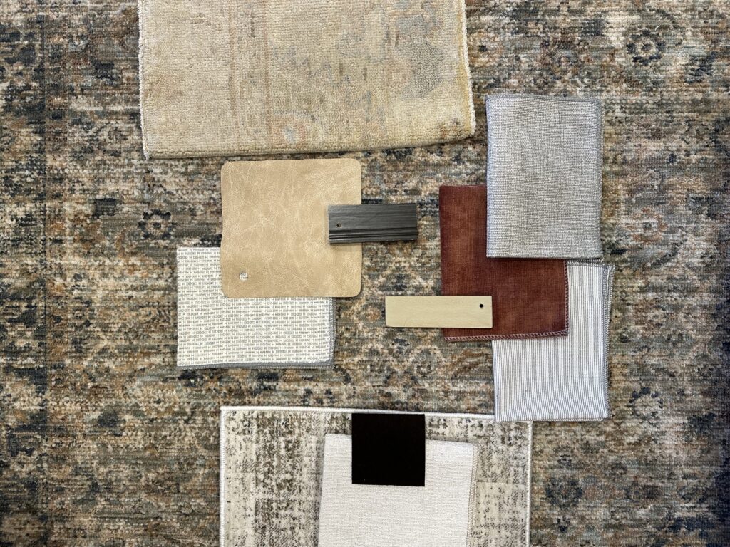
Take a look at how we plan for texture in our designs:
Feature image: photo credit, Perigold.


